Novelas do Minho - Illustrations & Editorial
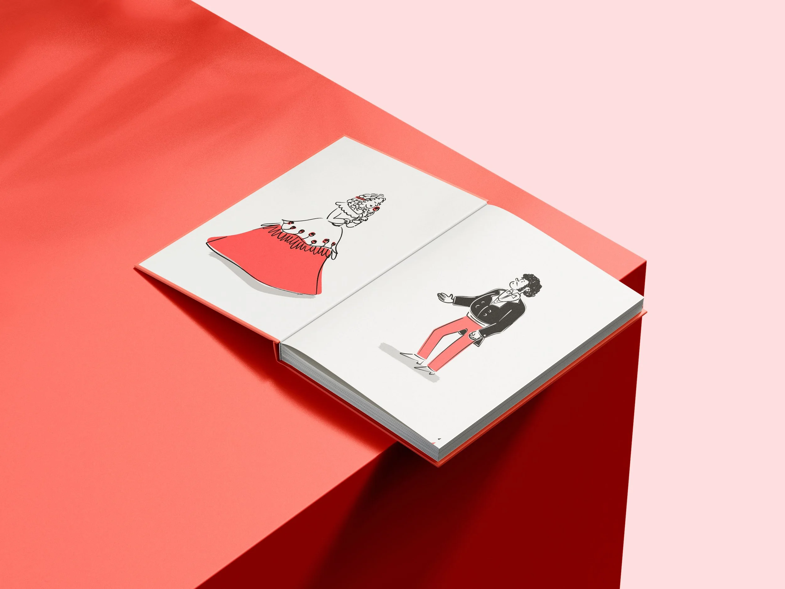
‘Novelas do Minho’ by Camilo Castelo Branco, was given as a university assignment to produce illustrations and to structure the editorial layout of the book. My interpretation revolved around the humorous undertone of each tale, which then reminded me of the clever illustrations seen in newspapers, such as The New Yorker. That, in the end, became the style I developed my illustrations for this project, picking up the minimalistic line and monochromatic drawing style, though I also introduced an accent color, soft red, not only to help bring focus to important details but to also relay the romance in the tale I revolved all my work on.

Editorial Design
Book
Digital Illustration

Cover
Following the logic of the illustrations throughout the book, when it came to the cover it made sense to keep the message, and also style, very clear and simple.


The Illuminated letter for the beginning of the chapter ‘Gracejos que matam’, was an interesting challenge, because this type of letter usually entails a very detailed approach that, for my project, I worried wouldn’t necessarily fit with the rest of the illustrations.
After careful consideration, I insisted upon inserting it and researched more modern interpretations of illuminated letters, which led to my final result.
I’m quite happy with the outcome because I believe the style of the letter and the ornaments are balanced well enough to check both parameters: keep the concept of the illustrations and maintain what was expected of these kinds of letters.
