SYnergia Portugal rebranding
As a final university project, we were supposed to reach out to companies that were open to having a rebranding proposed to them, even if hypothetical, and having us cater to the realistic brand needs of each company.
The one I contacted was SYnergia Portugal, a non-profit organization that focused on helping the youth with their creative endeavors. When I reached out I also had a meeting to collect information and learn a bit about how they communicate, to understand better what they might need.
In the end, this is what I developed as a rebranding proposal.

Brand Identity
Non-profit
Digital Illustration

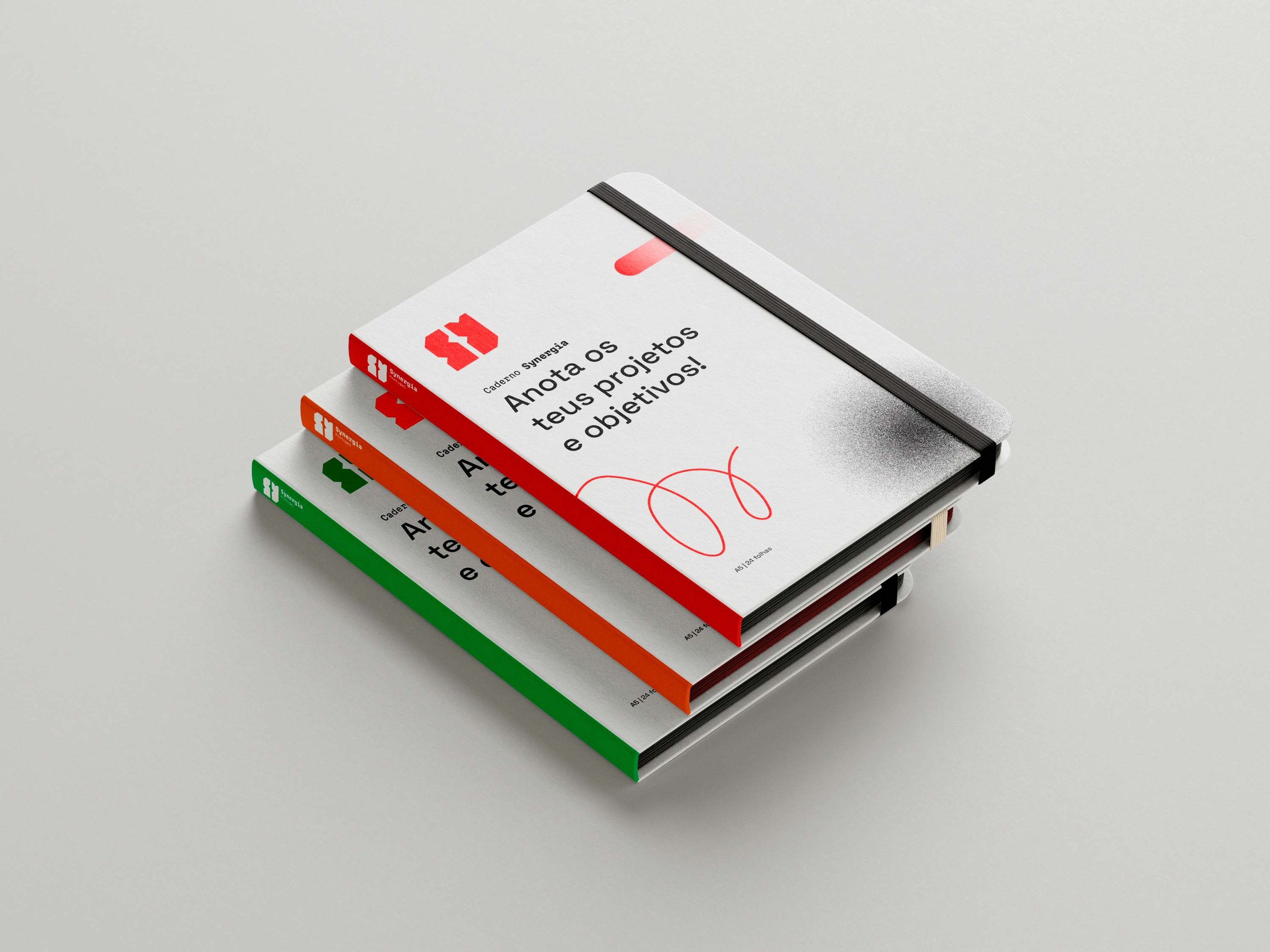
The new image
When studying SYnergia's brand the use of red and black as the main colors was very striking to me, since it's quite uncommon for a non-profit, even if it’s directed to young teens and up, to use such colors. For them to instinctually pick these colors, I interpreted as a bold and strong stance, that wanted to go against the norm, so I use that as building blocks for the new image.
The brand has two sides, the serious, strong, and professional, when dealing with different countries and collaborators, the other is the expressive and dynamic which for the youth they work for.
I decided to have the logotype carry most of the functional side, with a geometric icon, SY, for SYnergia, with triangular cuts, that for the brand symbolize the ‘connection dots’' for a bigger purpose and the dynamic side for the accompaniment of the layouts throughout the visual identity.

A bold, geometric statement to contrast with the other of SYnergia, which is the vibrant, expressive and dynamic side.
Logotype
Website overview


-
![]()
Sweater SYnergia
-
![]()
Health Department
-
![]()
Academy Department
-
![]()
Environment Department
-
![]()
Social Department
-
![]()
Culture Department


-
![]()
T-shirt SYnergia
-
![]()
Health Department
-
![]()
Academy Department
-
![]()
Environment Department
-
![]()
Social Department
-
![]()
Culture Department


T-shirt option with slogan and combines all the departments.
Banner example

For the Environment Department